
Aufgabenstellung
Das Adam-Jannik Architekturbüro steht für Originalität, Pragmatismus, Rücksichtsnahme auf Persönlichkeit, Menschlichkeit, Natur, und Vereinigung von Klassik mit Moderne.
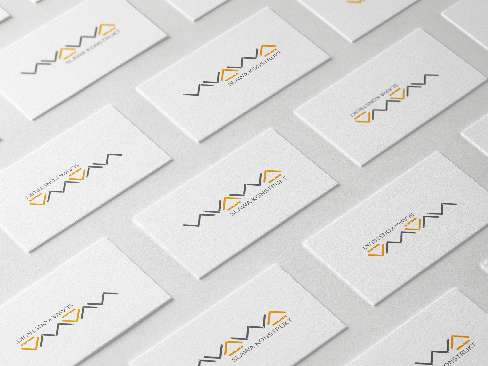
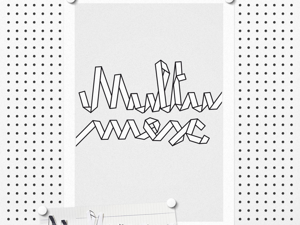
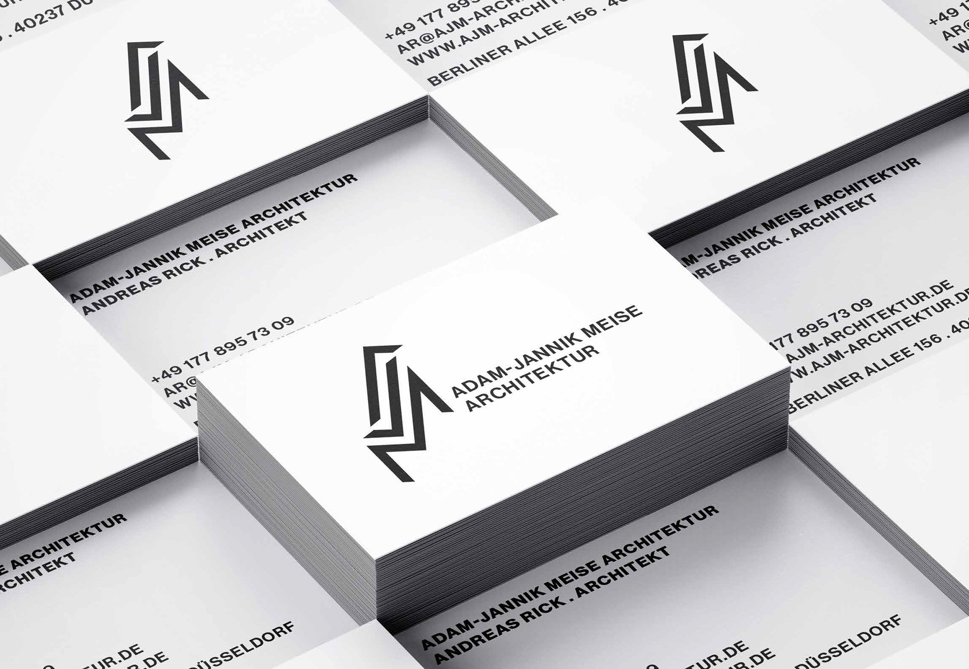
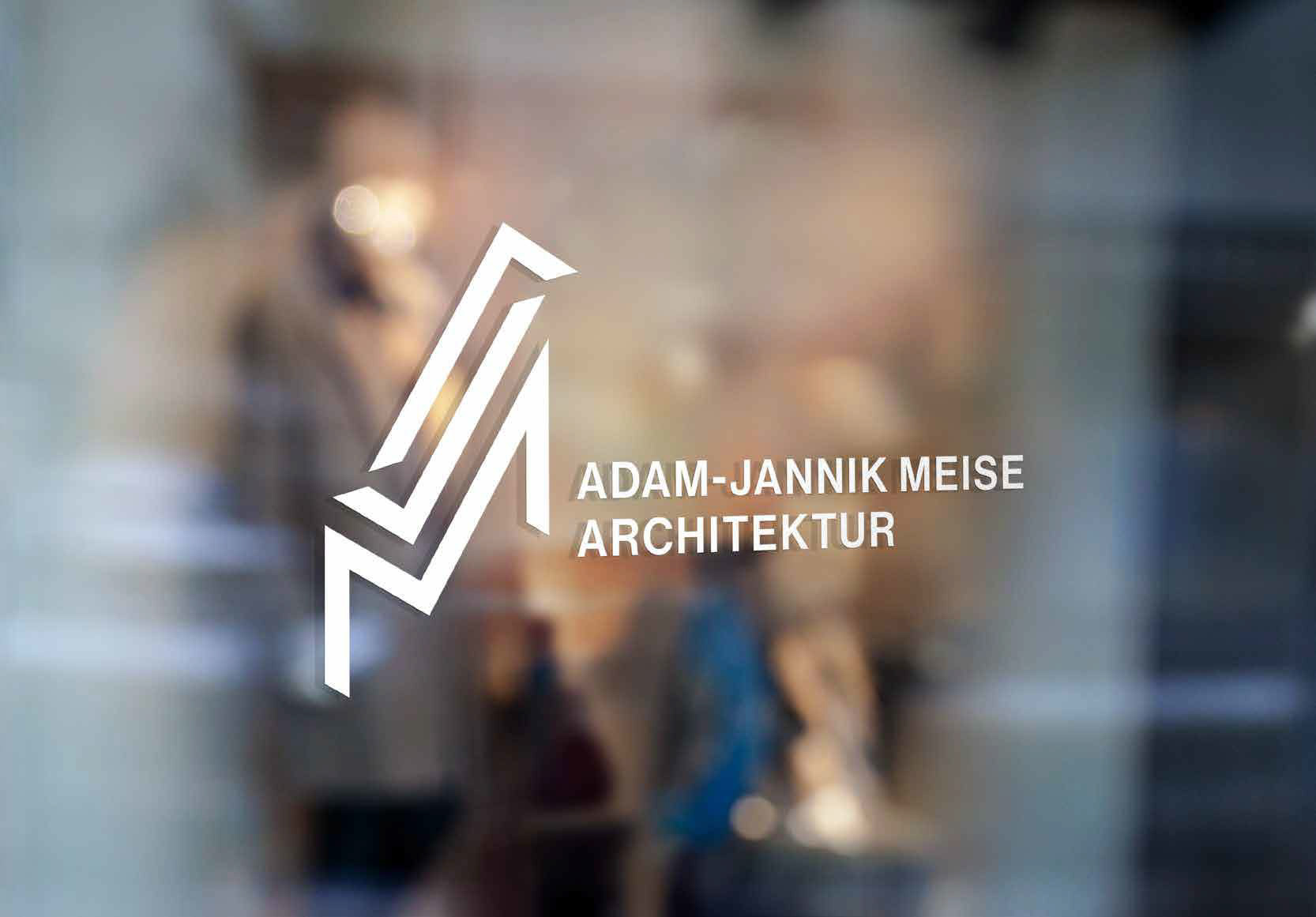
Die Aufgabe war es ein authentisches Erscheinungsbild zu entwerfen inklusive potenzielle Print-Anwendungen. Das Logo besteht aus den Firmierungs-Initialien A, J und M, dargestellt als Stützpfeilers, die an stabile Säule und Grundgerüst erinnern. Seine Wirkung ist dynamisch, lebhaft, und gleichzeitig stabil und markant.
Kunde
Adam-Jannik Architekturbüro | Köln, Deutschland
Designagentur
Sommerprint Communication Design | Düsseldorf, Deutschland
ArbeitsProzess
Briefing › Recherche › Brainstorming › Erstskizzen › Erstentwürfe › Rebriefing › neuen Entwürfe › Konzeptpräsentation › Kundenfeedback › Umsetzung › finale Korrekturen › Erstellung der Druckdaten
Dienstleistungen
Logodesign
Erscheinungsbild
Geschäftsausstattung
Mission & Task
The Adam-Jannik Architecture Office stands for originality, pragmatism, consideration for personality, humanity and nature, as well for unification of classic and modern.
The task was to design an authentic appearance with focus on print applications. The logo consists of the initials A, J and M as the pillar and is reminiscent of a stable pillar and basic structure. Its impression is dynamic, lively and at the same time stable and distinctive.
client
Adam-Jannik Architecture Office, Cologne Germany
Design Studio
Sommerprint Kommunikationsagentur | Düsseldorf, Germany
Process
briefing › research › brainstorming › sketches › initial drafts › rebriefing › new drafts › concept presentation › client feedback › realization › final revisions › printable files
Services
logo design
corporate design
stationary design